
By Chira Tudoran
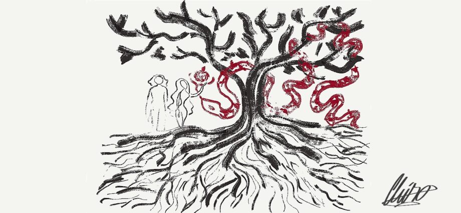
Look at the illustration above this text. What do you see? You notice several things: A tree, a man and a woman, a fruit, and a snake. Separately they don’t make any sense. Together they make a story.
In your mind, these elements are combined unconsciously. You know the story and you found it again in this illustration. What is different this time though? What words come to mind? For me, I think of “paleolithic” because I wanted to draw the story of Adam and Eve through the eyes of a caveman. However, when the same illustration was shown to others, they mentioned the words “eerie”, “roots”, “harsh”, “balanced”, “intentional”, and “familiar”. What led to these different interpretations?
To begin with, the role of art in portraying stories is to introduce you to the topic of the story. The colours, shapes, style, and materials used will set the tone of the story. Most of all you will see the fingerprint of an artist, embedded in the artwork. Moreover, there is also a balance between showing content but not giving too much away. An artist has to know the difference between adding details because they look nice and putting the details where they are necessary.
But what is necessary?
Every drawing tells a story. The first one is about the world within the paper. The second one is about the world outside of it.
Modern art, the kind in which you put a trash bag in a museum, shows quite a lot about the state of the outside world. In a world where hipsters pay to listen to Yoko Ono demonically scream at them, it gives a glimpse of an empty and corrupt landscape of the current art world.
There is hope, though. If Yoko Ono is the yin of this world, then Refik Anadol is the yang. Look at how artificial intelligence is used by this man to create art that is… magical.
Thankfully, he’s not the only one. Abstract art, gifs, animated videos, and digital illustrations are now more accessible than ever. Artists throughout the world now have access to an unprecedented amount of drawing materials for both real-life paintings and digital drawing. Graphic design has seen an explosion of content and ability in the last twenty years.
Moreover, the digital medium can also help the old art world, such as how now there is a Digital Database compiling more than 480,000 Artworks of the Louvre.
This shows that even though ugly art makes a headline, there is a vast array of diverse artworks out there. Outside of the media, art is alive and growing.
How does this affect us?
When we read, we see the images of the words, and when we see an image, a few words come to mind. This relationship between language and images is universal.
The role of art in politics and media has decreased because of the use of photography, however, major news sources such as The Economist and the New Yorker still use art to portray political and societal issues.
Can we create art about politics without being biased?
No.
Inherent bias is at the essence of art. It is the fingerprint of every artist. No two artists can make the same painting (unless one is painting a forgery). All artists have a certain level of bias because it is necessary so you can create your version of what you see or hear.
However when it comes to political artwork artists have to be careful; there is a fine line between political commentary and propaganda.
Propaganda is meant to get an emotional reaction out of you. It markets itself as the truth, which just so happens to be custom made for you. But you may ask, if all artists are biased and so is their art, what makes propaganda different? Well, it is simply not funny. Secondly, it steers your emotions and thoughts towards the path most useful for those who make it.
Political drawings, although they have their biases, are stories told differently. The aim isn’t to sell you a perfect world, but to show a politician’s funny mishap, a caricature, or a political opponent’s erroneous remarks.
You can tell the difference by the style, by the use of colours, and most importantly by the tone. Simply put, the context.
And why is context so important?
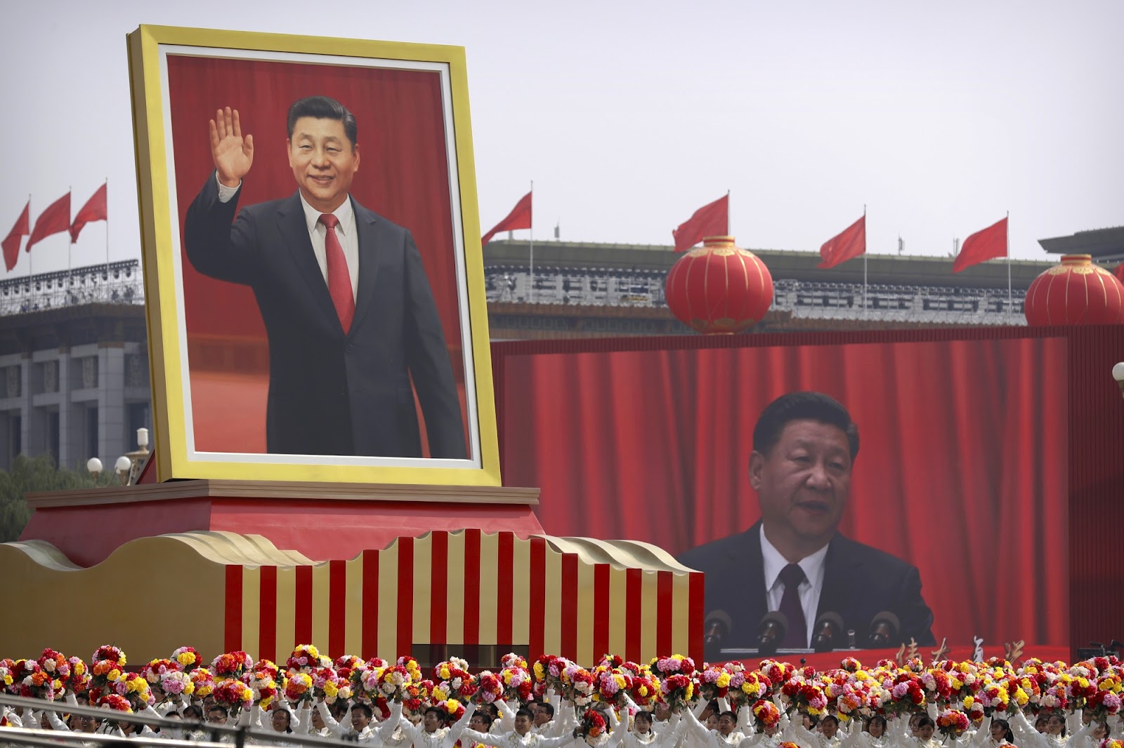
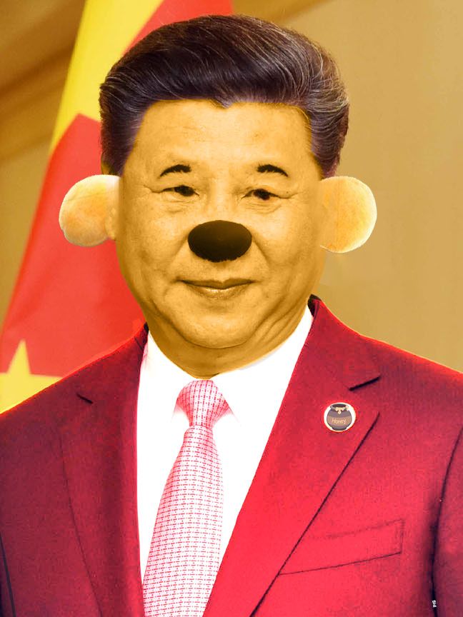
Because without context, both portraits of Xi Jinping listed below could be seen as official government press releases. Or allowed…
Humour aside, how do we address and analyze complex topics such as politics, history, economics, conflicts, and social issues? How do we give them the proper context? These topics can all be shown through visual storytelling.
This is why I will use my own illustrations as examples of the practice of using art to enhance storytelling. The purpose of this is that by explaining why and how I made the artwork, you, the reader, can pick up visual cues much easier.
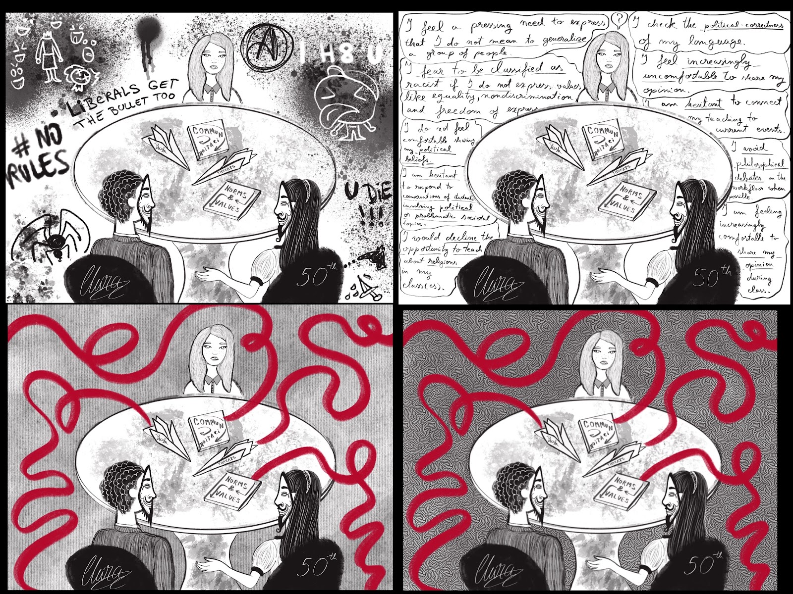
The New Kind of Security Breach: A Teacher’s Comfort Zone, is an article that comes in two parts with five illustrations attached.
Rosalie de Vries, the writer, did both a survey and two anonymous interviews, regarding how teachers feel threatened in the classroom. That’s why I chose to use anonymous masks for the professors at the table.
This is also why I chose black, white, grey and red as the main colours for the illustrations while the texture of the backgrounds keeps changing. Which translates into yes, these are different classrooms (backgrounds) but they all have the same problem (shown by different colours).
The graffiti illustration was actually made last, and made as a fun idea. It ended up being Rosalie’s favourite and it was used as the cover for Part 1 of the article. At the time I was confused why this sketch made more of an impact than the other illustrations, but then it clicked: it matched the tone of how the teachers and professors interviewed felt.
That’s how they see the change in their student’s behaviour in the last decades. By reading their testimonials in the article, the graffiti and crude jokes unconsciously appeared. This experience showed me yet again how interrelated words and drawings are.
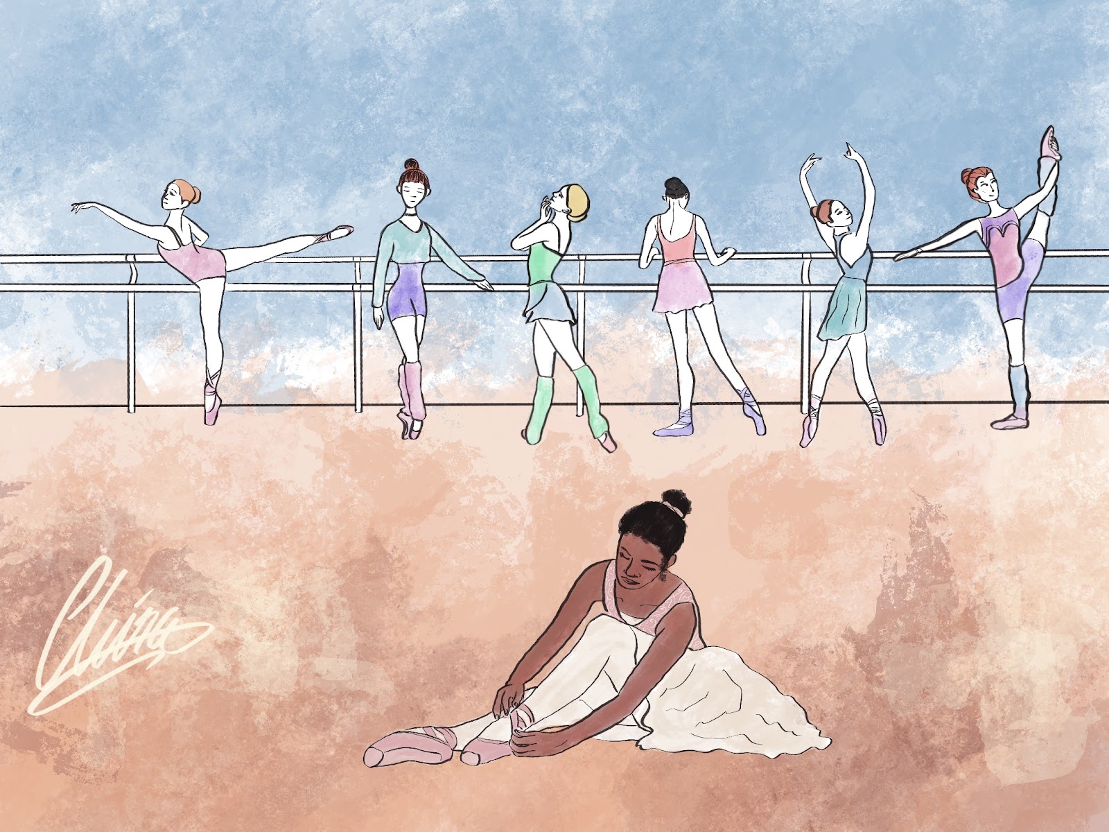
For the article Racist Institutions in the United States, by Lauren Griesedieck I made the illustration above.
What is most apparent is that the black girl is separate from the white girls. Secondly, you notice that they are preparing for a ballet class. Why did I choose ballet to show institutional racism in the US? Well, ballet is one of the most competitive feminine environments in the world. It’s hard for girls who meet the requirements (white, tall, skinny, etc.), but it’s so much worse for everyone outside of these traits. I chose ballet because it’s one of the toughest places where black girls can integrate.
The subtle details matter just as much, such as how the floor has skin tones on it and the higher you go the lighter the skin is. Lauren also mentioned “I remember when you drew it, I showed it to my mom and she thought it was so beautiful. I really like the emotion behind it because you can really feel the tension and I think you conveyed the feeling of exclusion and discrimination very well.”
Lastly, I made the black girl do her own thing, still preparering, still trying, all while sitting like a swan, because no matter what people throw at you, or exclude you, you still do your own thing. That’s how you succeed.
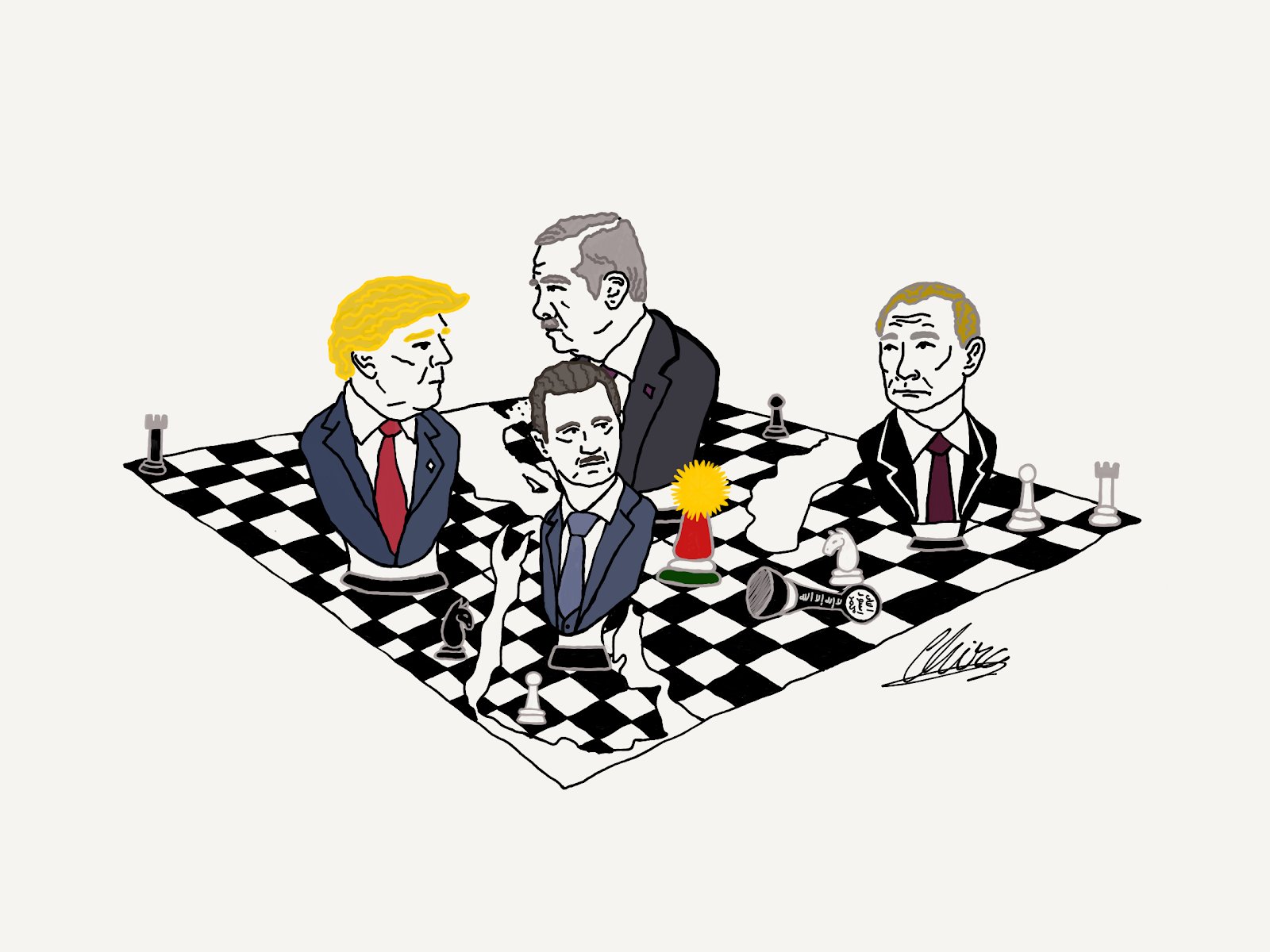
The article U.S. Withdrawal from Syria: A Shattered Prospect of Peace was written by Eugenia Valais and Ricardo Pereira Teixeira back in 2019. To this day it’s one of my favourite early illustrations.
The first thing you notice is the chessboard. Then how the chessboard is not just fragmented, but it’s actually a map of the Middle East. It’s a subtle detail but adds a layer of meaning to the story. Next, we see the big chess pieces. The four main players are the ones taking the decisions of the next move, however, if they make a mistake they can also be taken out of the game. They are positioned in their regions, except for Bashar al-Assad, who I drew in Saudi Arabia because I did not have space for him in Syria. Moreover, you will see how all of them are looking at each other. Erdogan is looking at Trump, while Trump is glancing at Assad. Assad is eyeing Putin. Meanwhile, Putin and Trump are not losing track of each other.
Then we look at the medium chess pieces. The Kurds are still standing, but they are a small piece in comparison with the other players. ISIS is down, as they are no longer relevant.
The small chess pieces (e.g. towers, horses, and pawns) are put in their proper places on the board. This is a small detail for chess players.
Conclusion
I wish to write a full paragraph to sum up this mini-lecture on finding meaning in art, but the only words that come to mind are: stop, look, think, and see. It literally boils down to that.
Edited by Macklin Miezejeski, artwork by Chira Tudoran